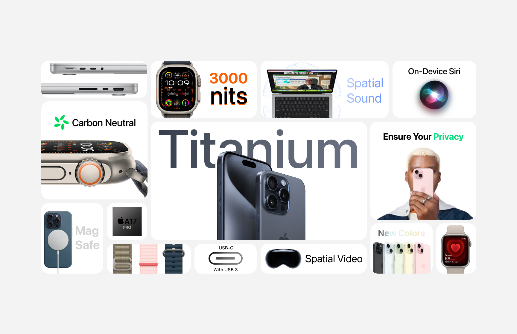
The Apple Way: Six Principles we always keep in mind
At Wildcard, we get our inspiration from all sorts of cool places, like design studios Koto and Designwerk, and big names like Samsung and Apple. These guys push us to keep leveling up our design game and getting smarter in the field.
Apple, especially, has been a great influence on our web design and UI/UX projects when it comes to our Design-Thinking. Their groundbreaking sucess in interactivity, micro-interactions, user experience, and UI design has really shaped how we do things.
At Wildcard, Apple's high standards and principles have always inspired us to strive for the even better solutions. We think these principles are key to nailing great design, and we encourage you to adopt them in your work too. Here are the most important ones for us.

1. Simplicity is Key
Like Jonathan Ive already said:
"Simplicity is not the absence of clutter, that's a consequence of simplicity. Simplicity is somehow essentially describing the purpose and place of an object and product.”
Apple is all about keeping things simple. By cutting out the fluff, they make sure their products are super clear and easy to use. You can see this in their sleek hardware designs and no-nonsense user interfaces, especially on their smartphones. At Wildcard, we totally vibe with this approach. We focus on what really matters, especially when it comes to the interfaces and apps we create.

2. Consistency Everywhere
Consistency is a big deal in Apple’s design. Whether you’ve got an iPhone, iPad, MacBook, or Apple Watch, the user interface looks and feels the same. This makes it super easy to jump between devices and apps, keeping the whole experience straightforward.
And it's not just about interfaces and operating systems — consistency is key in all design areas, like branding, campaigns or web design. It makes everything feel cohesive and satisfying. You can see it for yourself how we use it in practically all our case studies.
3. Details. Details. Details.
A keen eye for detail makes products shine, and Apple, well, they've nailed that. Every design element, from smooth animations to spot-on alignment of text, icons, buttons or any other digital element, shows their dedication to perfection. This focus on the little things, like small interactions and haptic feedback, really amps up the overall user experience on any digital media. Whether it's websites, programs, or apps, any interactive media benefits from a little love.

4. It’s all about the user
Apple puts the user right at the heart of its design process. They do tons of research and testing to make sure their products really solve problems. Features like Touch ID and Face ID, Voiceover and Magnifier make everything super easy, efficient and accessable. Accessibility is always a big deal when it comes to user-centered design. Being able to tweak how an app looks and feels — like customising colors, contrast, and text sizes — empowers everyone, including people with disabilities to use products, websites and more the way they want and can.

5. A Visual yet Functional Hierarchy that slaps!
A Functional Hierarchy is super important when building pretty much any type of design. Books, posters, apps, websites, and almost anything we interact with these days have well-thought-out hierarchies that help users find exactly what they're looking for.
Apple totally nails this. They use clear visual hierarchies in EVERYTHING they make to guide users’ attention to the most important stuff. Smart use of color, contrast, and typography makes their interfaces really easy to scan, navigate, and simple to understand.

6. Intuition all the way!
When you're building interactions for websites, apps, or even operating systems like Windows, MacOS, iOS, or Android, there's one thing you should always keep in mind when planning user flows and interactions.
❕ Keep it Natural
Making interactions intuitive is key, even if it's "just a website." As we mentioned before, details matter, and so do smooth interactions. Apple nails this by mimicking real-world experiences. Multi-touch gestures, swipe actions, and natural animations make the digital experience feel more tangible and responsive, making it easy for users to interact with their devices, apps, or websites.
Conclusion
At Wildcard, we think great design comes from keeping things simple, consistent, detailed, user-focused, and easy to navigate. Apple’s design principles have really inspired us more than a few times in how we tackle design projects.
We suggest you use and try these principles in your work as well. By doing so, you’ll create designs that look great and are super functional and user-friendly. Just like the big ones do too.
This might also interest you…
Is your big idea ready to get real?


.png)
